john-Long-design-icon
Loading...
Loading...
Loading...

Bio-Techne Luminex Tool Share Configuration

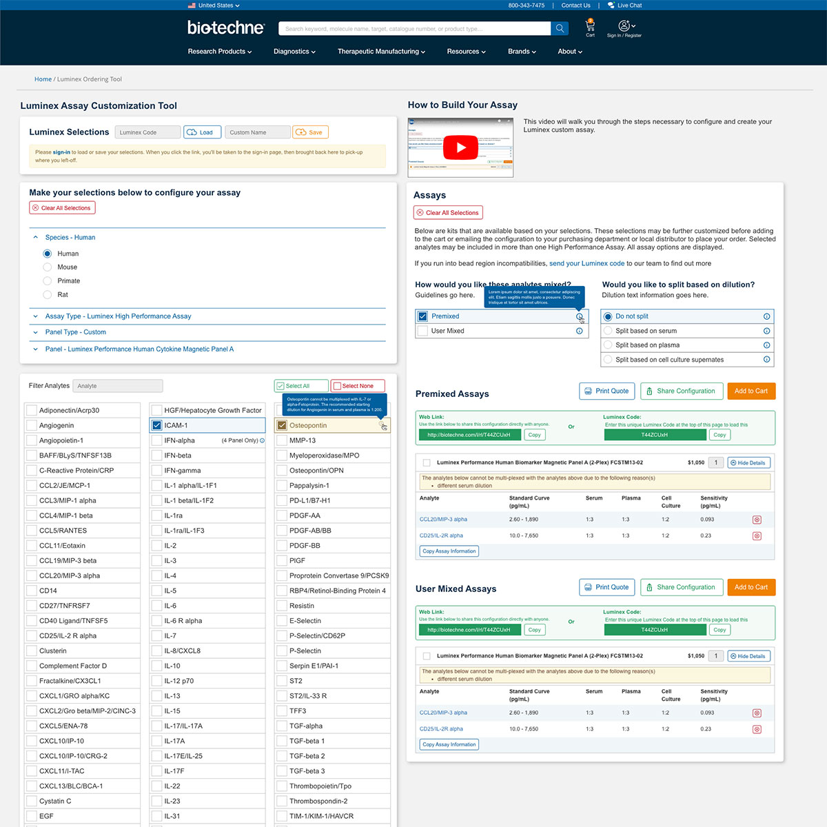
Before Bio-Techne, a customization tool resided on an older platform. Upon its integration into the Bio-Techne website, it necessitated enhancements. Among these enhancements was the incorporation of a “Share Configuration” feature. This functionality aimed to empower users to disseminate their saved assay kits or configurations efficiently. Essential to this feature was the provision of an optional web link or Luminex code, facilitating seamless communication with purchasing departments for customized configuration purchases.

To visually articulate these requirements for both development and user experience (UX) teams, several compositions were crafted. These compositions serve as tangible representations for review and testing, ensuring optimal presentation and user-friendliness.

The user flow delineates the process: upon selecting “Share Configuration,” a conspicuous green notification section emerges. Within this section, the web link or Luminex code is automatically generated for both Premixed and User Mixed Assays. Each shareable kit section is intuitively designed to facilitate effortless copying and pasting into email or messenger applications. Furthermore, to enhance user convenience, a dedicated “Copy” button is provided, further streamlining the process.

Bio-Techne COA Finder Tool

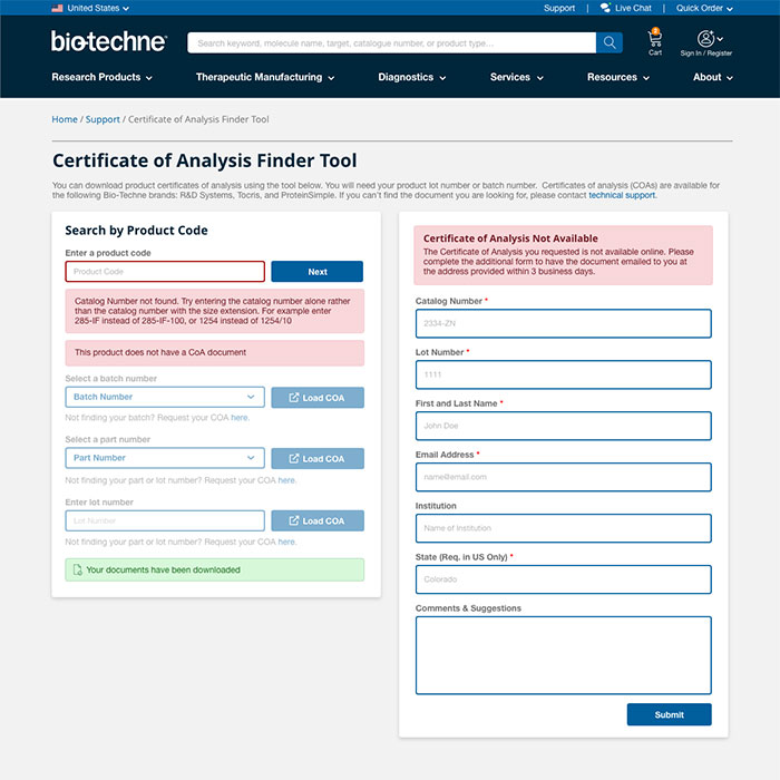
The COA Finder Tool serves as a valuable resource for customers seeking Certificates of Authenticity (COA) for specific products. Users simply input the lot or batch number to access the relevant COA. These certificates, provided by manufacturers, offer detailed insights into the product, ensuring it meets customers’ requirements. The tool is intelligently designed to dynamically adjust its interface based on user input, presenting tailored next steps and comprehensively representing diverse form options.

These visual compositions were crafted to elucidate both the development prerequisites and the anticipated user journey, showcasing the array of options essential for creating the website tool.

Bio-Techne Language Selector

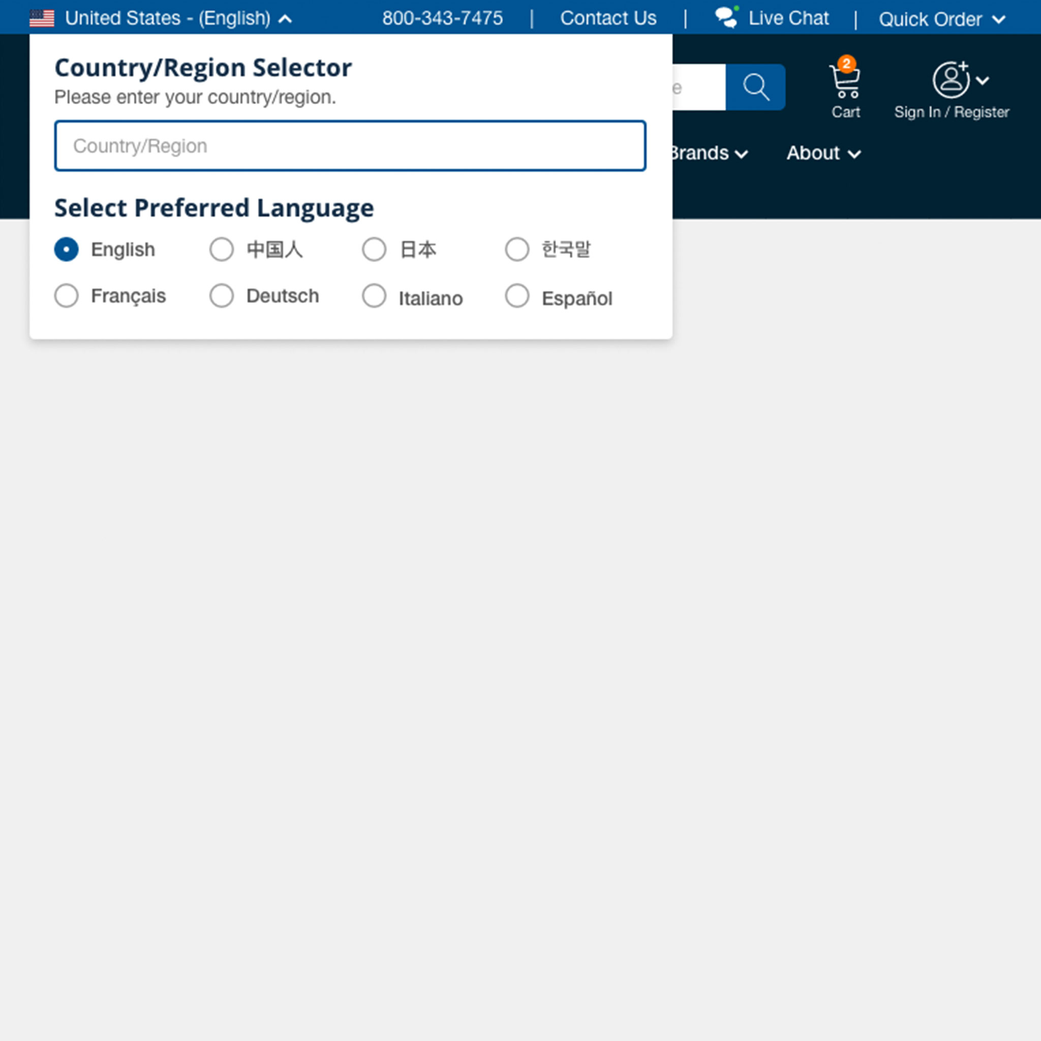
The rollout of the new Bio-Techne website underscored the necessity of integrating a country and language selector to cater to our global clientele. This feature served a dual purpose: firstly, to facilitate the display of region-specific pricing determined by distributor availability, and secondly, to broaden language coverage for a more comprehensive dissemination of Bio-Techne’s information and products in customers’ native languages.

Furthermore, ensuring the visibility and usability of the language selector across various devices such as tablets and mobile phones was paramount. These design compositions were furnished to the development team, serving as a guide for implementation and to aid our styling team in clarifying the design direction and meeting the usability requirements.

Bio-Techne Manage Account

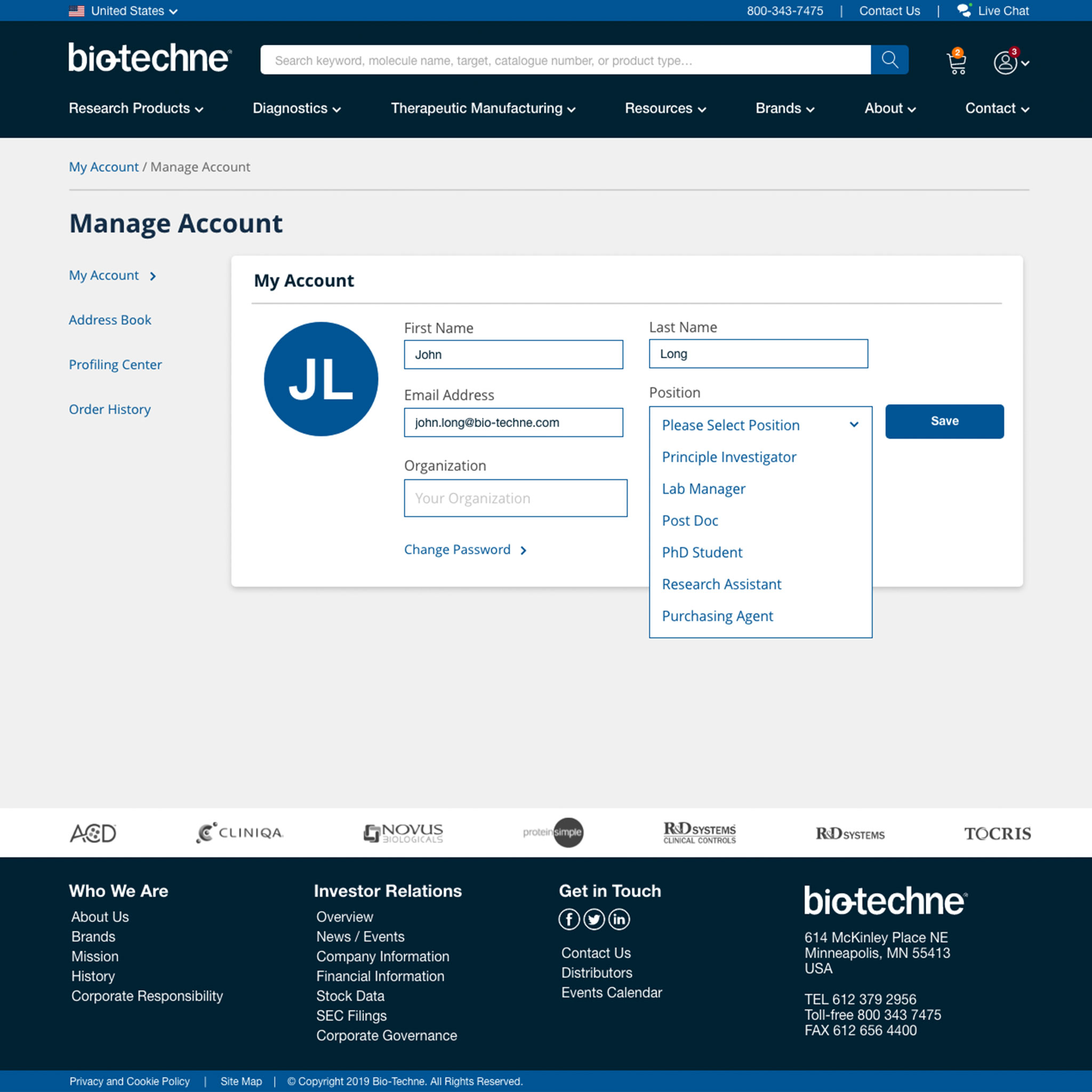
With the launch of the new Bio-Techne website, prioritizing the development of an account center became essential. This center would serve as a repository for fundamental customer login details, encompassing name, phone number, email address, and organizational information. Moreover, we aimed to establish a dedicated space enabling clients to efficiently manage their address book, facilitating streamlined billing and shipping processes for enhanced checkout experiences. Assigned with the responsibility of conceptualizing the initial designs for these functionalities, my focus was on crafting a user interface that ensured intuitive navigation and user-friendliness, thereby enhancing the overall customer experience.

Bio-Techne Website Redesign


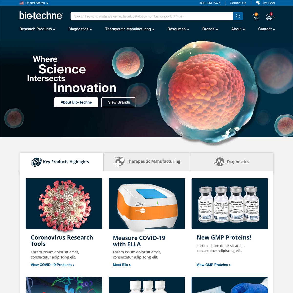
In 2020, we seized the opportunity to revitalize our website, giving it a fresh and contemporary branding appearance. Additionally, we aimed to integrate all of Bio-Techne’s brand websites into the new Bio-Techne site, unifying our online presence. Our aspiration was to create a Bio-Techne site that emulated the comprehensive nature of Amazon in the biotech life sciences industry.

The Problem

The previous website had started to exhibit signs of aging and no longer fulfilled its intended purpose. It primarily acted as a temporary solution while we worked towards developing the future site. Its main function was to provide links to the websites of our various brands, but it lacked e-commerce capabilities. Consequently, users had to navigate to a separate website to make purchases.

The Solution

Ultimately, the new website would serve as a centralized hub, housing all products from Bio-Techne’s diverse brands, offering a convenient and comprehensive destination for everything related to life sciences. The redesign project was driven by the objective of aligning our online platform with the current marketing materials and tradeshow strategies of our creative team.

The Chemist Barbershop

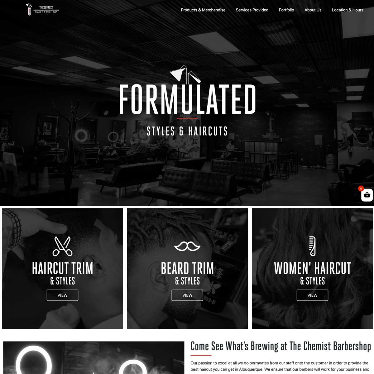
Recently I had the opportunity to build a custom website for a barbershop. The goal of the website was to help share the unique culture and vibe customers experience whilst visiting this particular barbershop. The barbershop’s theme is inspired by a popular Netflix TV series called Breaking Bad which takes place in Albuquerque New Mexico which also happens to be the hometown for this particular barbershop and draws upon this inspiration for the site. The website was also supposed to feature a portfolio of recent work via Instagram posts, as well as a fully functional e-commerce store to sell products the shop commonly uses and recommends to its customers.

Defiant Hemp Company

The Client

Defiant Hemp Company began as a startup subsidiary to Defiant Industries that specializes in hemp farming, distillation and CBD oil production.

The Problem

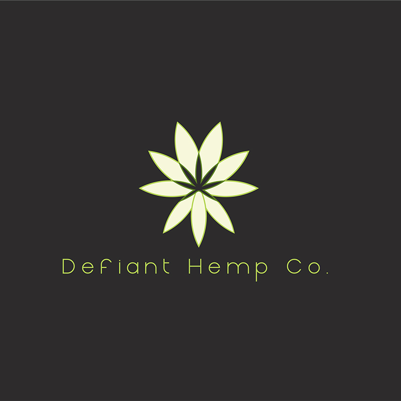
Defiant Hemp Company began quickly with production and onsite extraction and the company was in desperate need of a logo that conveyed the therapeutic benefits of CBD oil to their quickly growing list of customers.

The Solution

I was able to use a series of geometric shapes to subtly define a hemp leaf profile within the negative space of the circular forms. Additionally, I included a series of flowering petals just outside the hemp leaf shape to communicate a therapeutic spa-like feel to the logo that doesn’t just focus on the hemp leaf as the only form. The hemp leaf is more subtly noticed as the root of the products while the benefits of CBD oil products go beyond weed culture with safe and therapeutic healing properties for those that consume the products. This was the end goal for their branding and they felt this logo really nailed the look and feel they wanted for their new products and business.

Village Inn and Bakers Square Wireframes

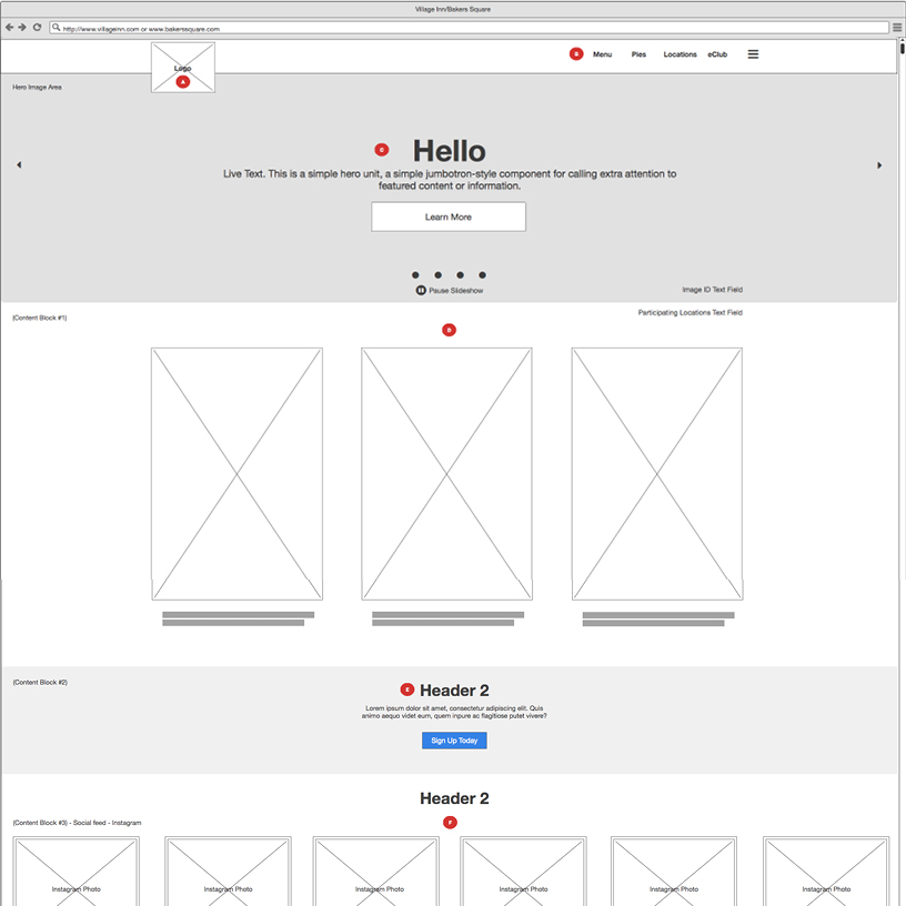
American Blue Ribbon Holding’s company is the parent company for both Village Inn and Bakers Square restaurants. While employed at a digital marketing agency located in Lakewood, Colorado I embraced the task of beginning their website redesigns with new and original UX/UI wireframe designs that would eventually serve their respective design teams to direct intended layout and functionality.

The Problem

Both Village Inn and Bakers Square’s current websites were becoming dated and the marketing directors for each respective division engaged us to begin work on a redesign starting with UX/UI design wireframes for the intended layouts and functionality for the new sites. Both sites would largely match in terms of layouts and content with minor differences between the two sites. The companies wanted a more modern approach to their website that would be fully responsive and allow for dynamic imagery based on time of day, favorite location search features and geolocation services. Additionally, the companies had to meet WCAG 2.0 Compliance and were

The Solution

I worked closely with an external development team to develop detailed wireframes that detailed all the intended layouts and functionality for all required templates. Meticulous notes were kept outlining the exact functions of each template page, including dynamic hero imagery based on time of day, specific drop-down functions, location search, and geolocation functionality as well as any other modules that needed further explanation. These wireframes served to inform the designs and overall development.

Village Inn

The Problem

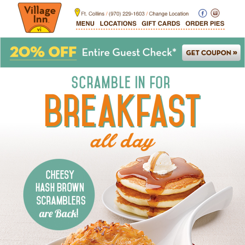
While employed at a digital marketing agency in Denver, CO, I was regularly tasked with designing and developing weekly HTML emails promoting specials or coupons for various locations. Many of these promotions were to be advertised annually for particular entrées, pies or gift cards.

The Solution

We developed reusable design and development templates so that we could easily update with new content quickly each week. These templates were also capable of responding for mobile, dynamically swapping from wider layouts to taller layouts to achieve better readability for mobile devices. All of our emails were Litmus tested for render reviews and quality control to produce the best possible email content for Village Inn’s customers. Our team has worked closely with Village Inn for over 3 years designing and developing weekly HTML content that combined with marketing send data reports helped Village Inn engage with their customers on a weekly and monthly basis.

UCHealth Marketing Templates

The Problem

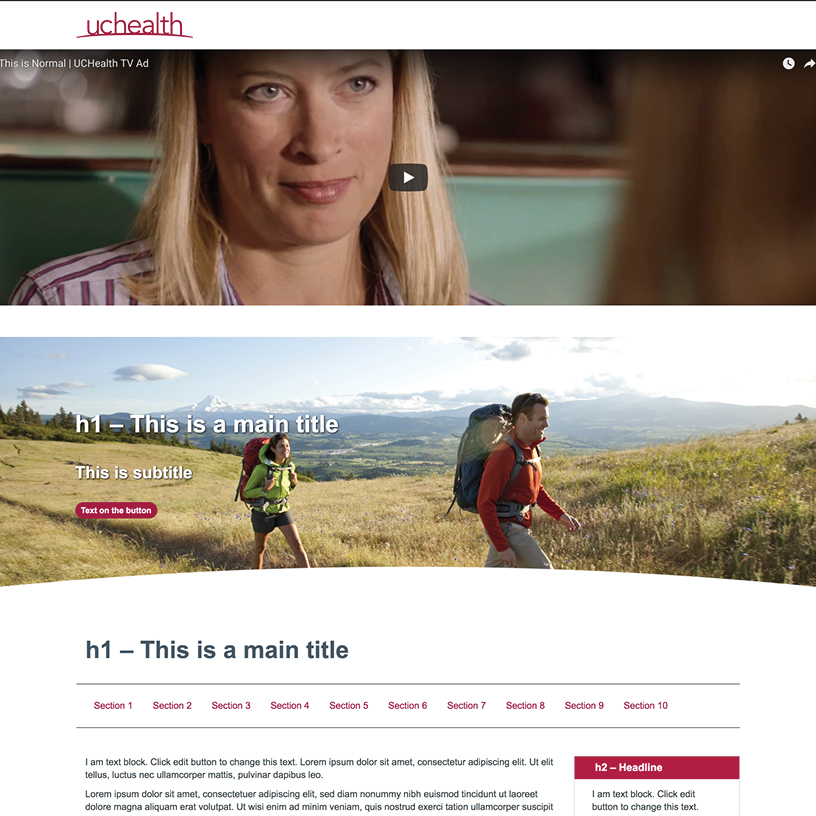
When I arrived at UCHealth’s marketing department it became quickly clear that many internal departments and service lines had a regular need for the ability to create their own landing pages for specific events or sweepstake offers. Currently, there wasn’t a clear set of rules when creating new landing pages, or what UX design should look like or accomplish. Most departments were starting with a largely blank slate when creating new landing pages and this wasn’t particularly effective for employees/users that were not familiar with how to build new pages, and content areas properly. This also created an ongoing problem of inconsistency with new pages that differed greatly from the main uchealth.org page branding, sections, layouts, and styles.

The Solution

I volunteered to design two new internal templates for users to choose from, one that would serve as a basic page template and one that would serve as a promotional template. Depending on the intended usage and messaging of the new landing page, users could select one of the two new templates and proceed to create their new page. Additionally, the landing page templates include matching branding, sections, layouts, and styles commonly used on the main uchealth.org website pages. This new system would serve as a starting place to assemble new pages going forward and also serve as an approved way to generate new content. Each template comes with a large selection of section choices for information, videos, sliders, paragraphs and bulleted lists that users can select where to insert new content and how to use each section. Any sections that are not used. can simply be removed. These templates were designed and developed to be fully responsive and helped to lock down on and prevent unapproved branding for new digital marketing landing pages.