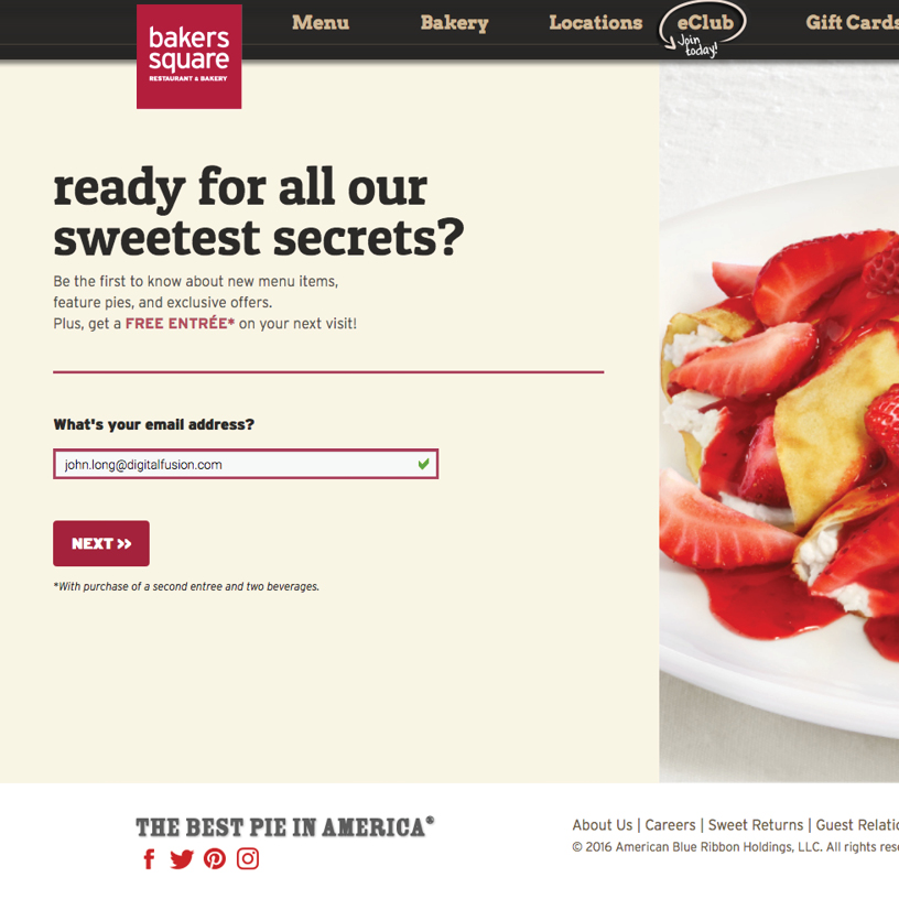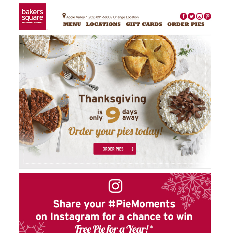
Bakers Square is an easygoing eatery & bakery chain serving American comfort food & signature pies all around the country.
The Problem
During employment at a digital marketing agency located in Lakewood, Colorado we acquired business designing and developing their weekly HTML email newsletters. The restaurant chain moved to an enterprise level email marketing platform and needed assistance in administrating, managing subscriber data extensions and deploying email communications on a regular basis.
The Solution
For over 3 years we provided administration, technical architect direction, email design services, HTML development and Litmus testing and deployments. Regular emails included free pie Wednesday promotions, holiday pies sales, entrée specials and gift card promotions.